Everguide Promote
August 8, 2013
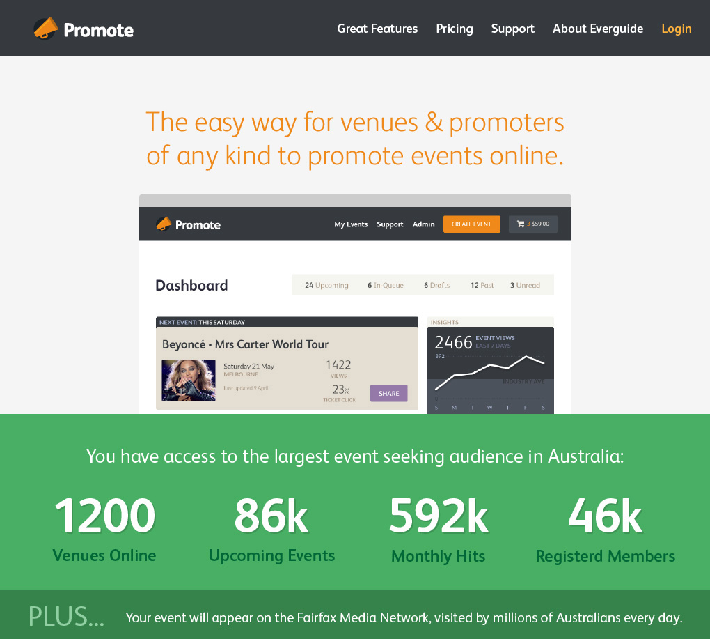
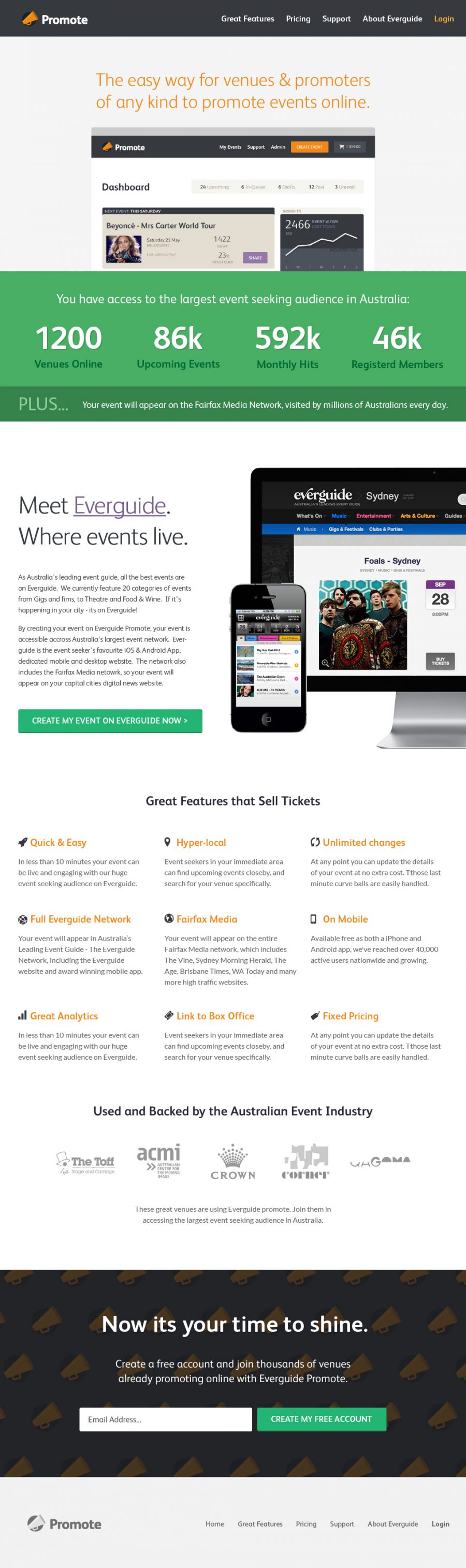
Over the last 12 months I’ve had the privilege of leading the design of Everguide’s Promote application. Everguide Promote is an online promotional tool, providing venues and promoters across Australia with an easy and effective way to promote their events online. Wether it’s a music gig, a gallery opening or a farmers market, Promote provides a familiar and logical platform to create, publish and analytically track your event.
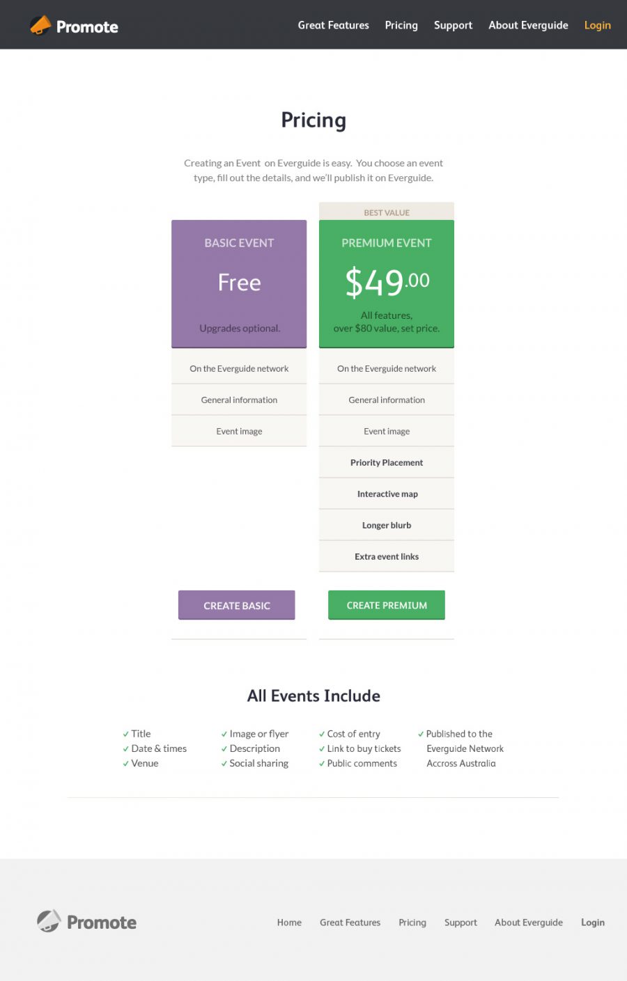
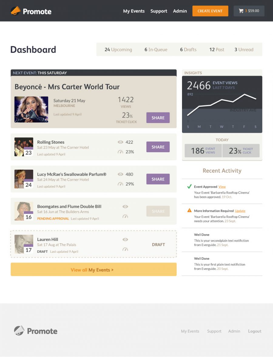
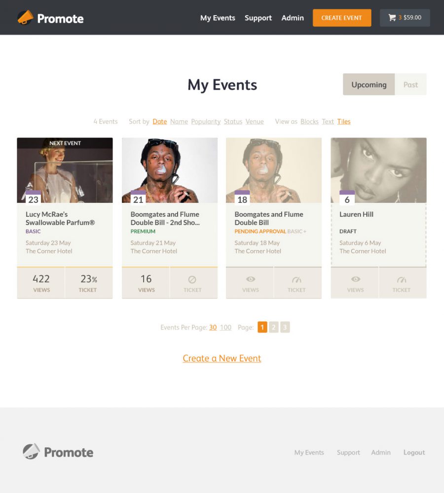
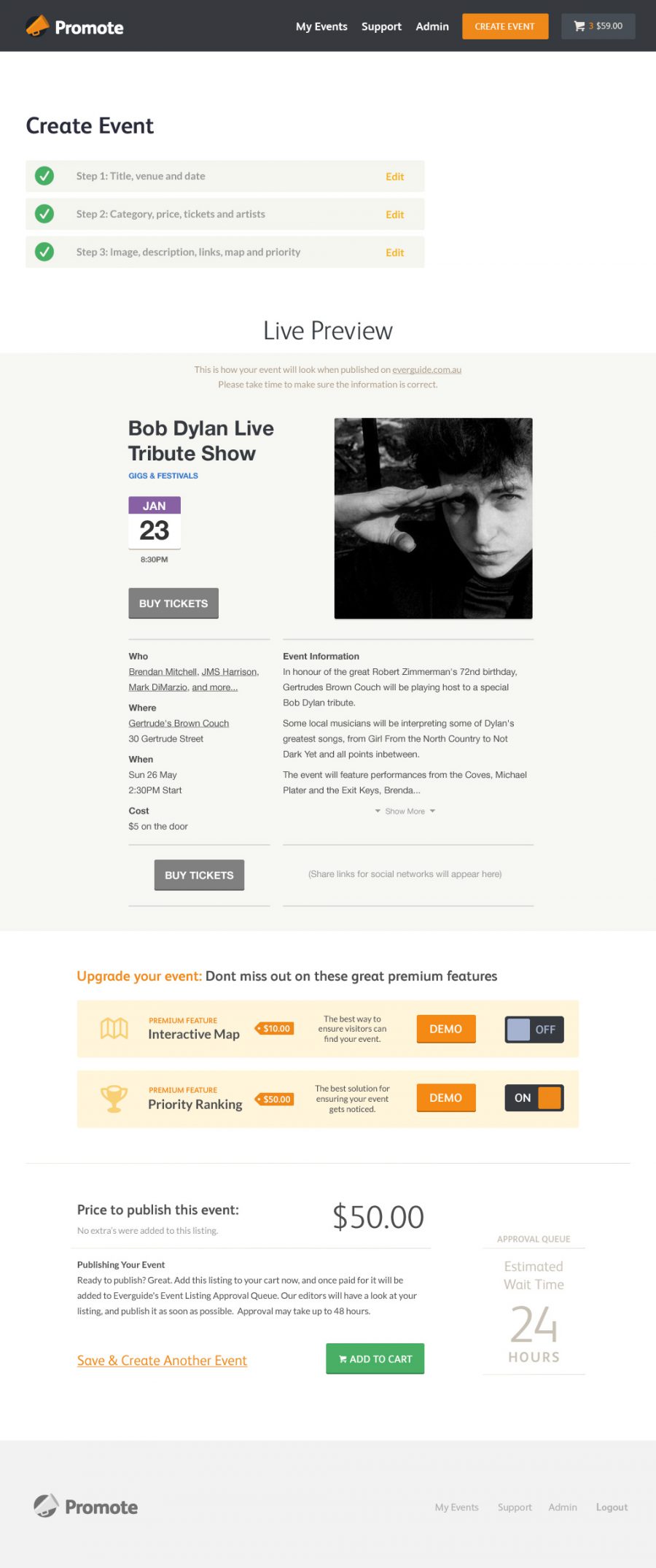
The visual language of the website was designed from scratch, in an effort to create a truly original and unique new Australian digital brand. A functional colour palette was developed – laden with meaning and relationships to the event creation processes in the app.
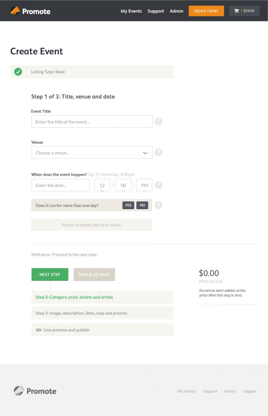
Typography is paramount throughout the design, which strongly embraces modern web-font technology. The headline typeface is FS Albert Web, and the copy, form and table text is all set in Łukasz Dziedzic’s Lato. Dramatic differences in type size and weight come together to present a rich and engaging data entry process with strong guidance and intuitive coaching.
Constructed entirely in Adobe Illustrator, the Promote app takes on a modern flat aesthetic. This simple, clear and legible visual language achieves two key goals. Firstly it increases the accessibility and legibility of elements on each page. It adds clarity and deeper meaning to colour relationships, and in doing so boosts user confidence. Secondly by eliminating excessive effects, styles and layering, the render time and page weight is significantly reduced, resulting in a faster, more streamlined user experience.
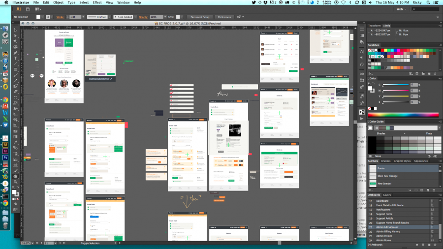
Everguide Promote being designed in Adobe Illustrator
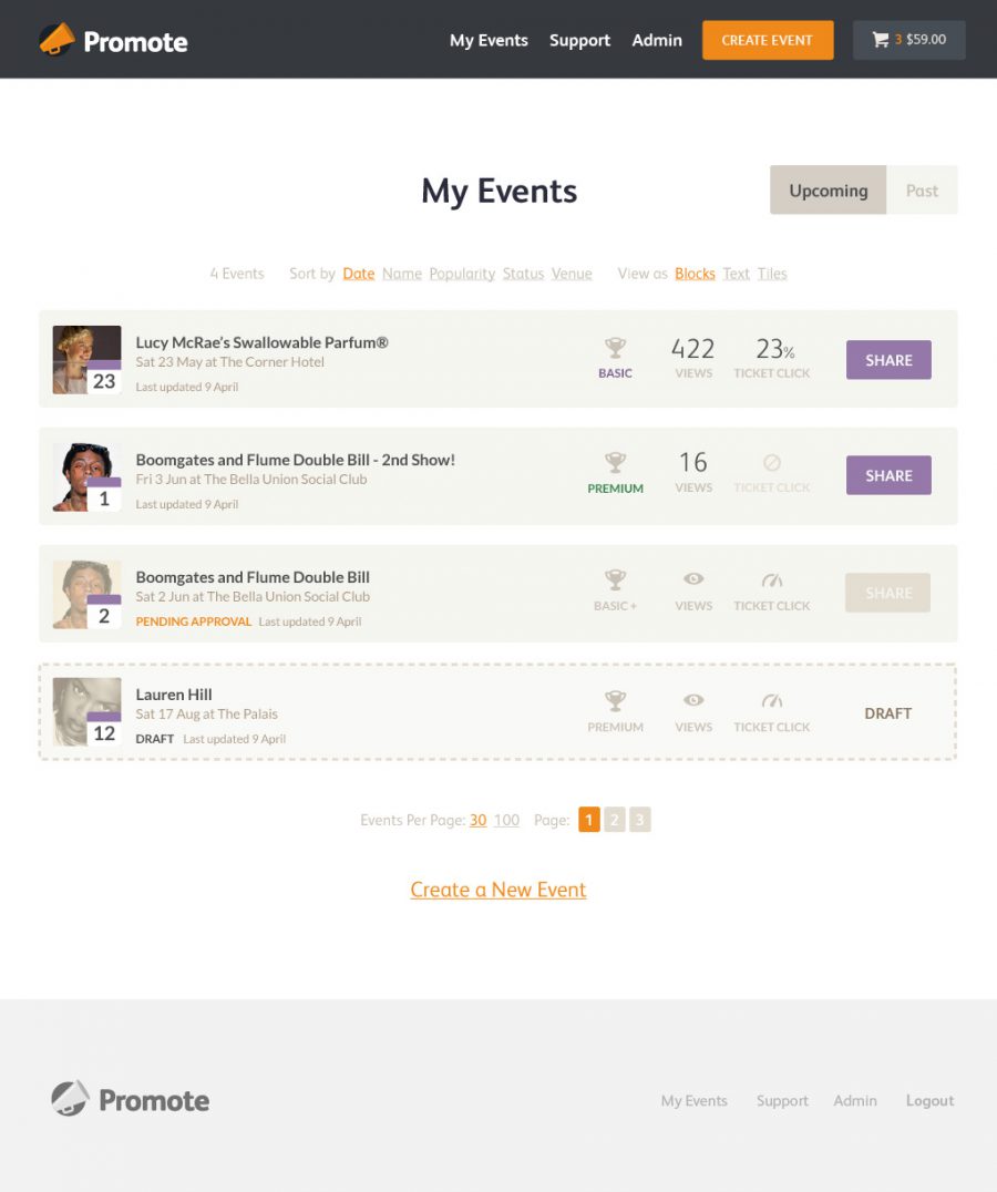
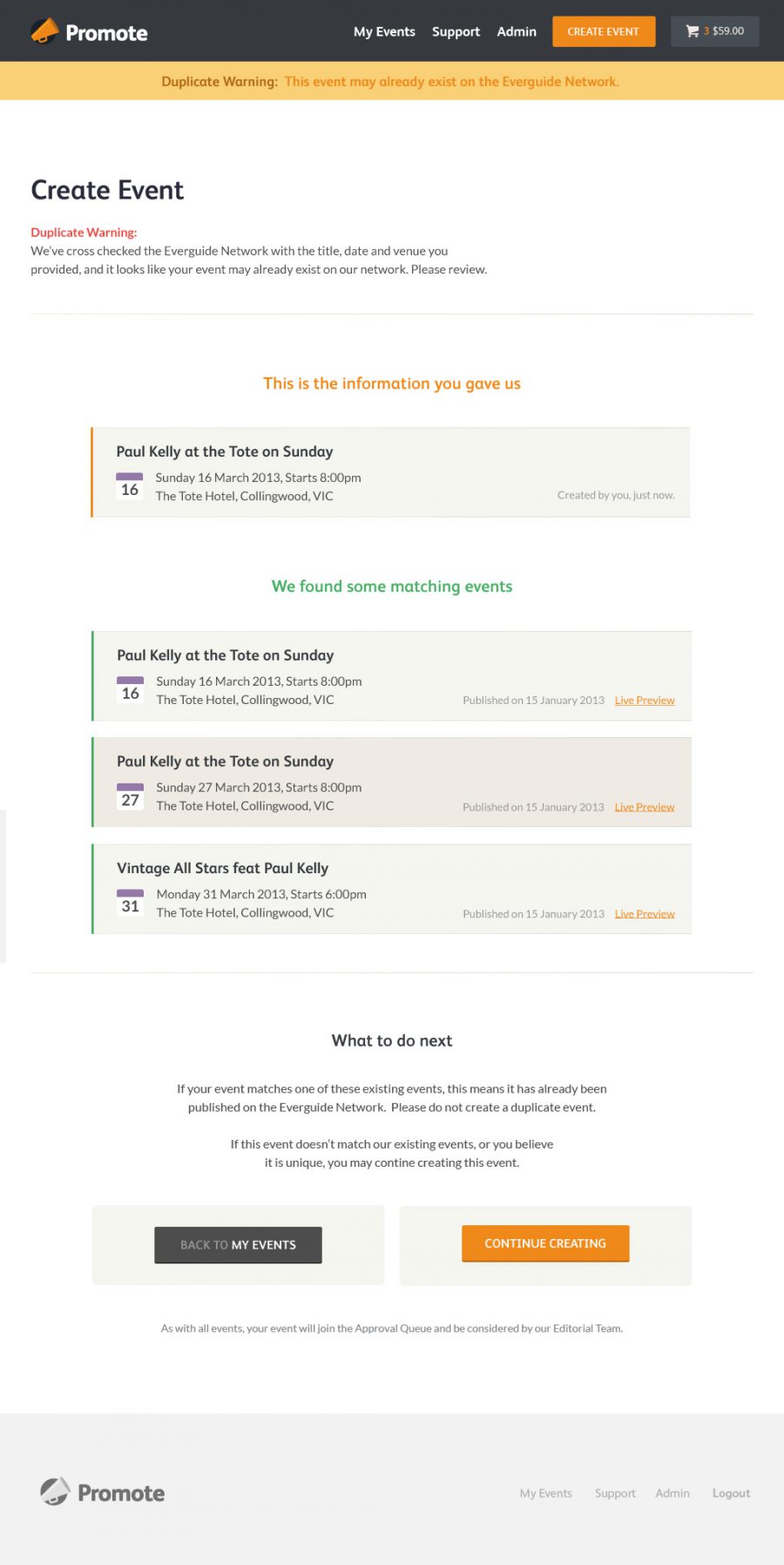
Promote is designed for a very wide audience, spread right across Australia. Users with little or no computer experience – even those who don’t own a computer – are accounted for in every step of the process. Clear labelling and generous vertical rhythm are specified throughout the site. Strong left margin reading lines are the cornerstone for all the forms in the app. These design decisions combine and allow users to anticipate their next step, and develop a clear memory of their path through the event creation process.
While it is intended that the clean, friendly and minimal brand messaging persists with Promote’s users, the design aims for the simplicity, ease of use and intuitive functionality to resonate the loudest with the venues and promoters of Australia.