Quick study of web text and typography on an iPhone 6 and iPhone 6 Plus
September 22, 2014
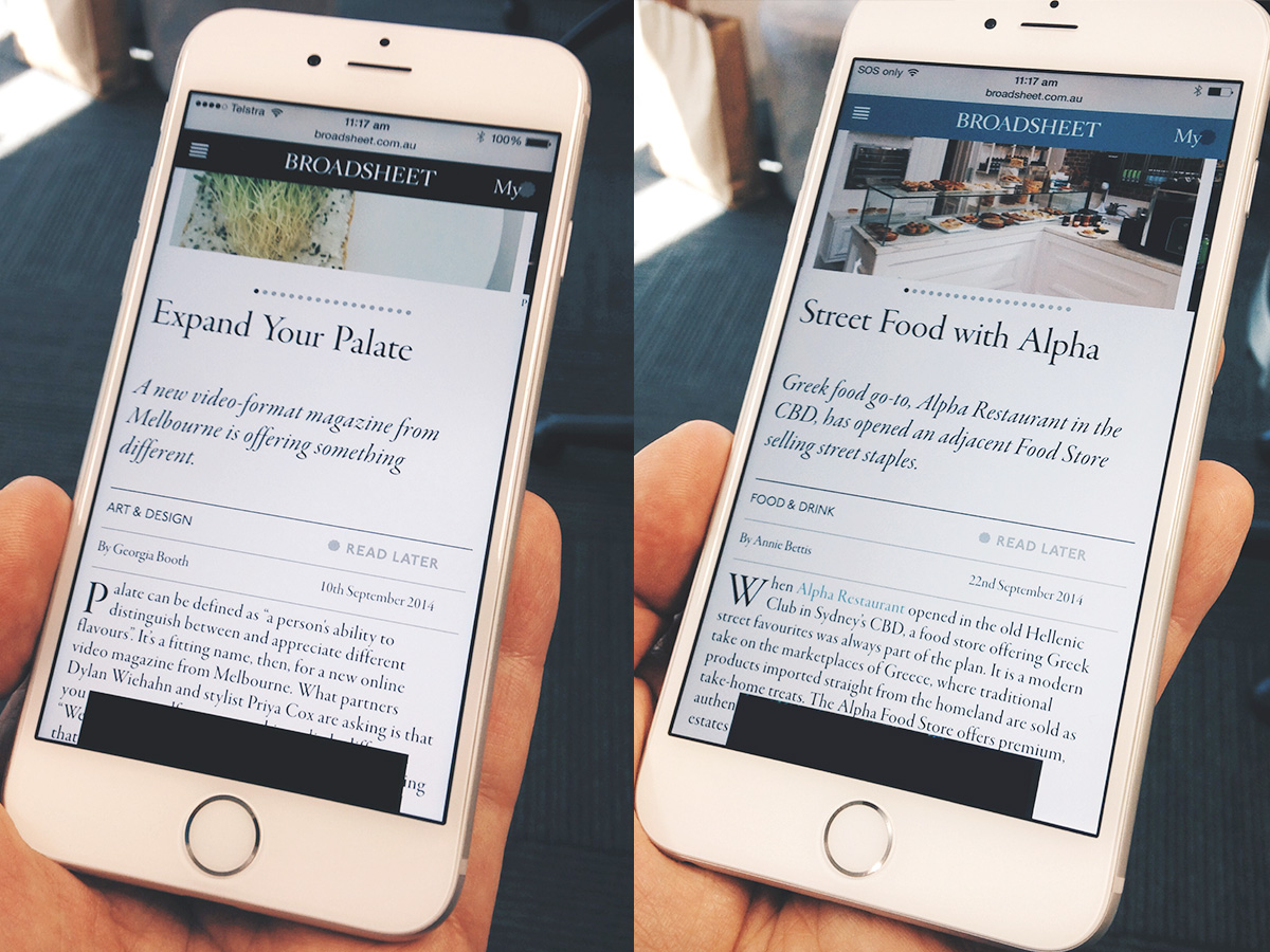
Very exciting day today – I have both the iPhone 6 and iPhone 6 Plus in my hands.
I’ve been reading a lot about the upcoming devices – an important milestone for Apple to step out of the single-screen-area space.
The guys over at Paint Code have published a cracking article for designers, demystifying the different resolutions now in play from Apple. most notably for me, is the 18% greater PPI on the iPhone 6 Plus, taking the resulting screen resolution up to 401ppi. Thats cray! Thats more than 30% higher than high-def printing (at true 300dpi) – an impressive standard. But how will the web hold up?
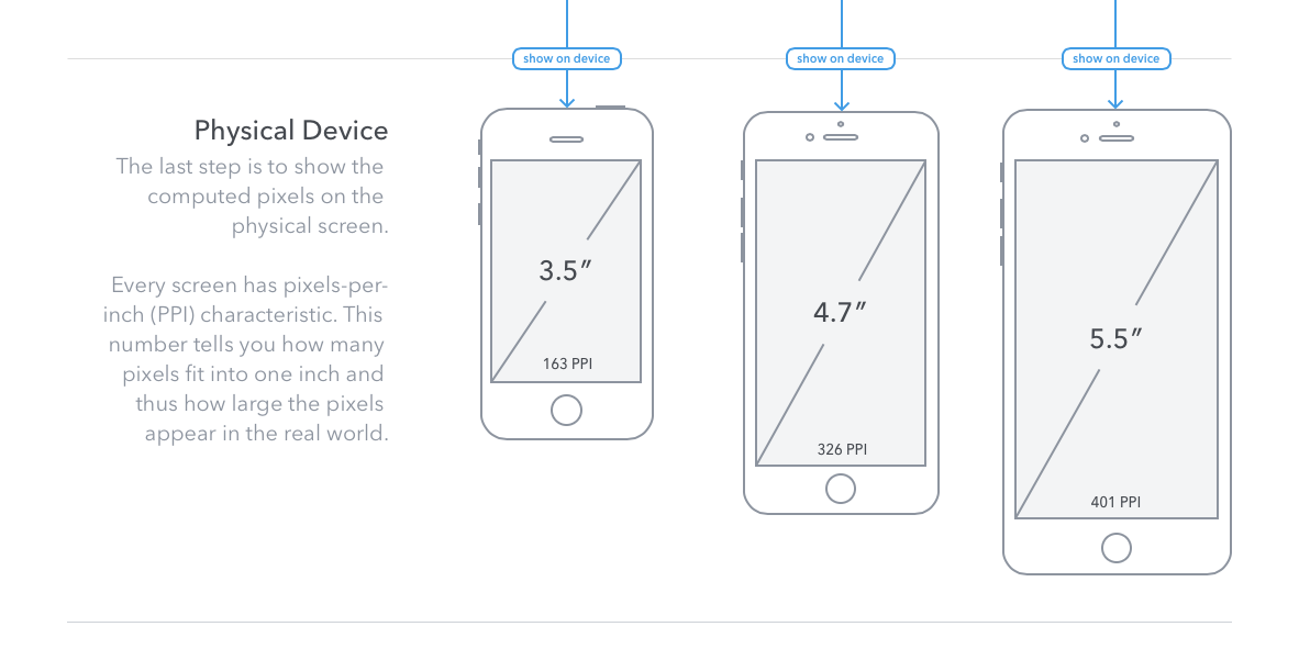
iPhone screen sizes reported by PaintCode
It always thrills me to read Broadsheet on a mobile device, and experience the fantastic typographic design. Specifically the headers set in Adobe Garamond Pro, which to me are a beacon of just how gorgeous web type can look on the web.
There’s no fancy integrations, no high-tech sub-pixel renderings, just well chosen typefaces and thoughtfully set text.
[tom-collins bgcol=”#3B4D5C” textcol=”#EDECF0″]”Instead of opting for that (responsive design) approach, which we feel compromises the design to fit different devices, we looked at the devices you’re using most, and created a site specifically for those experiences. Broadsheet has been optimised to the way you use it.” – Tim Fisher[/tom-collins]
For this first comparison, lets look at a photo of both phones side by side. At a glance, we can see the larger screen areas come into play, and see a better relativity in final type size than we saw when the iPad mini was launched.

A broadsheet article with headings on an iPhone 6, and iPhone 6 Plus side by side.
If we zoom in and look closer, the enhanced pixel density of the iPhone 6 Plus screen is apparent. Comparing lower case ‘m’ and ‘n’ characters, the link is more clearly defined. With more pixels to work with, the display of the same typeface yields more whitespace, ultimately resulting in a cleaner reading experience.
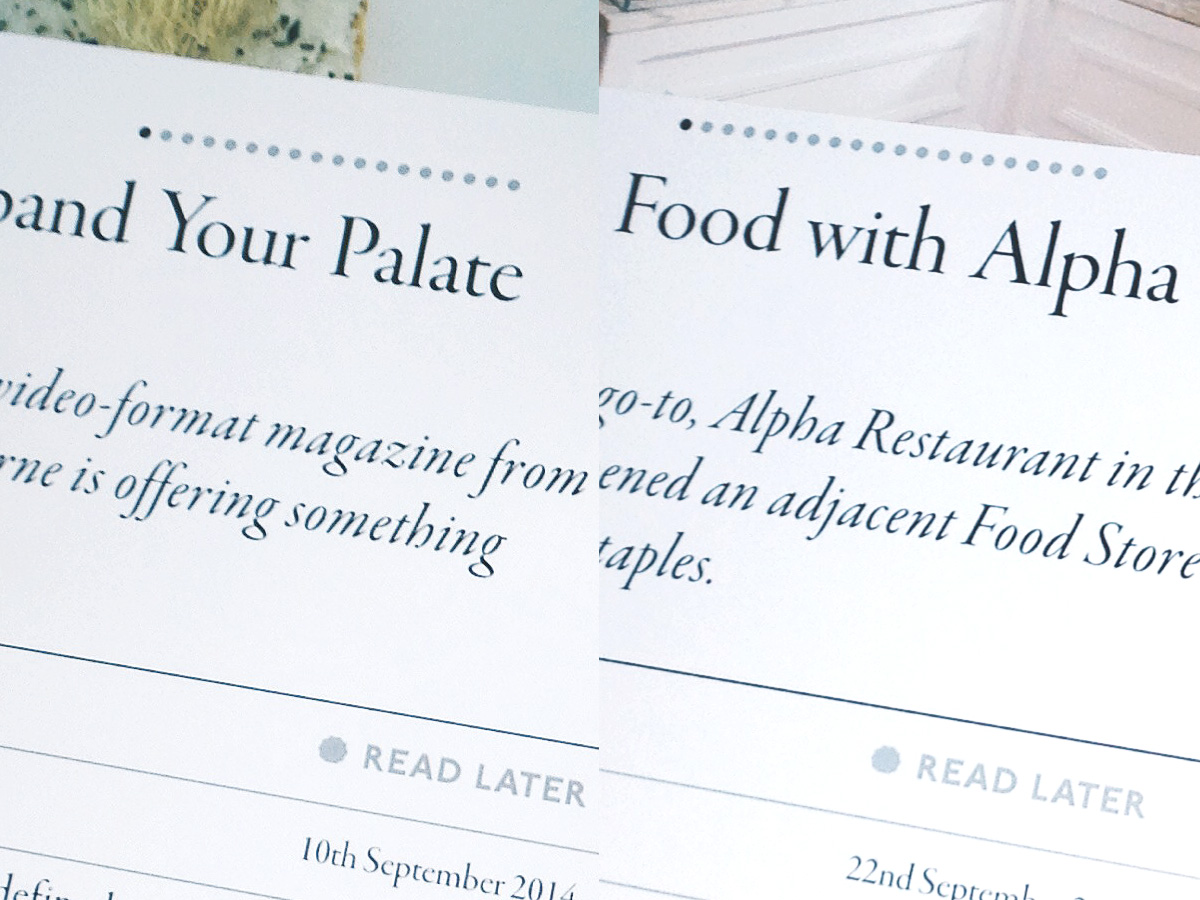
An enlargement of the headings on an iPhone 6, and iPhone 6 Plus screen side by side.
What I like here is that the mobile reading experience is enhanced not by reductive design, or using a cleaner, smoother typeface – quite the contrary. Broadsheet is able to deliver the best Adobe Garamond reading experience in a digital context, far closer to the typeface designers’ intention than has ever before been possible.
You can read more about the recent redesign of Broadsheet in this article by revered Melbourne writer Tim Fisher.
***
Update:
Since this article was posted, I’ve had a few discussions about this issue. Some people have pointed at the way I have displayed the ‘test’ here, and questioned how accurate the comparison can be from a photograph.
So, to extend the article, and make it super-clear what Im talking about, I’ve prepared another couple of graphics to put things into context.
The first graphic shows a true screenshot from my iPhone 5C, an iPhone 6, and an iPhone 6 Plus, side by side, scaled proportionally. The screenshots are all of the same article on the Broadsheet mobile website.
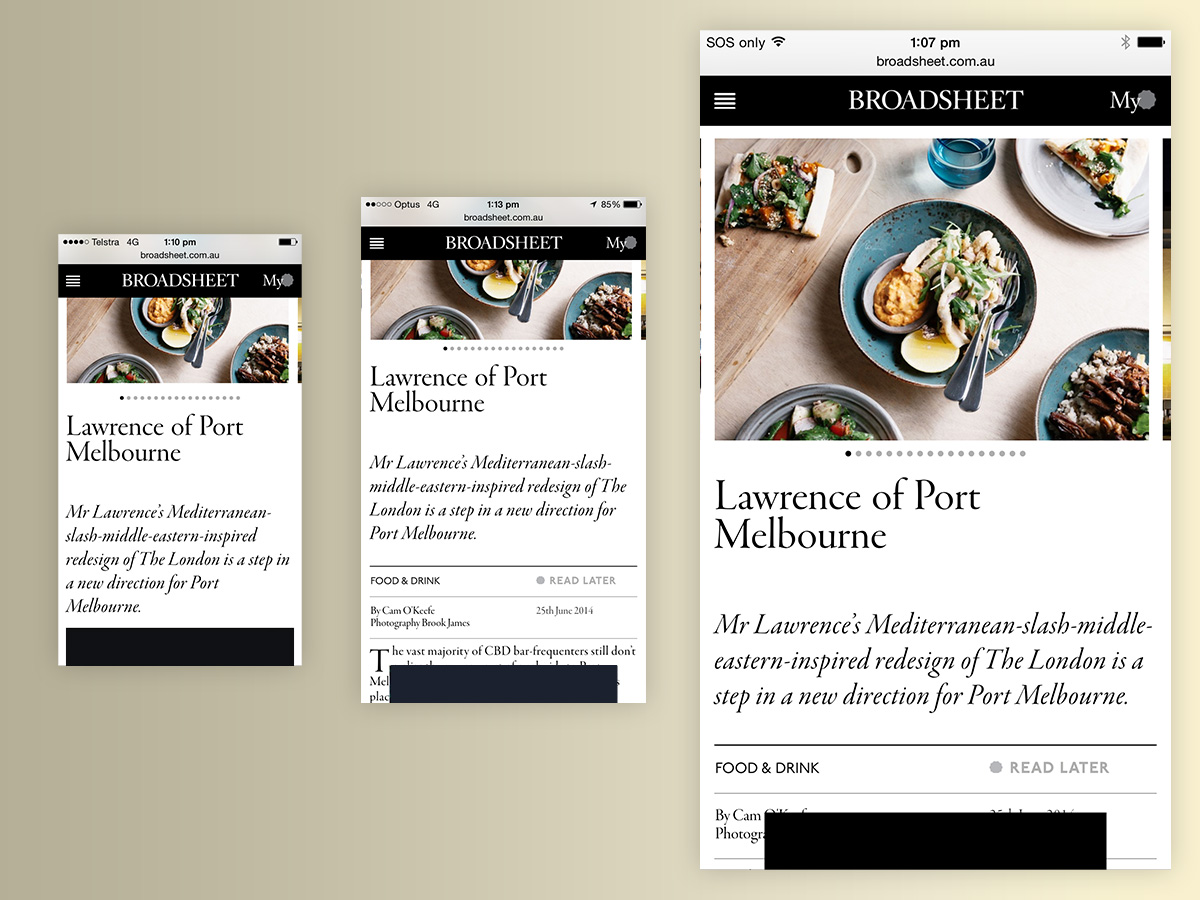
Screenshots of the subject article, scaled proportionally to show the pixel density difference of the iPhone 5C, iPhone 6, and iPhone 6 Plus.
The next graphic shows those same screen shots scaled up proportionally to 323%. This shows how the type is being rendered on screen, and the difference in css-pixels.
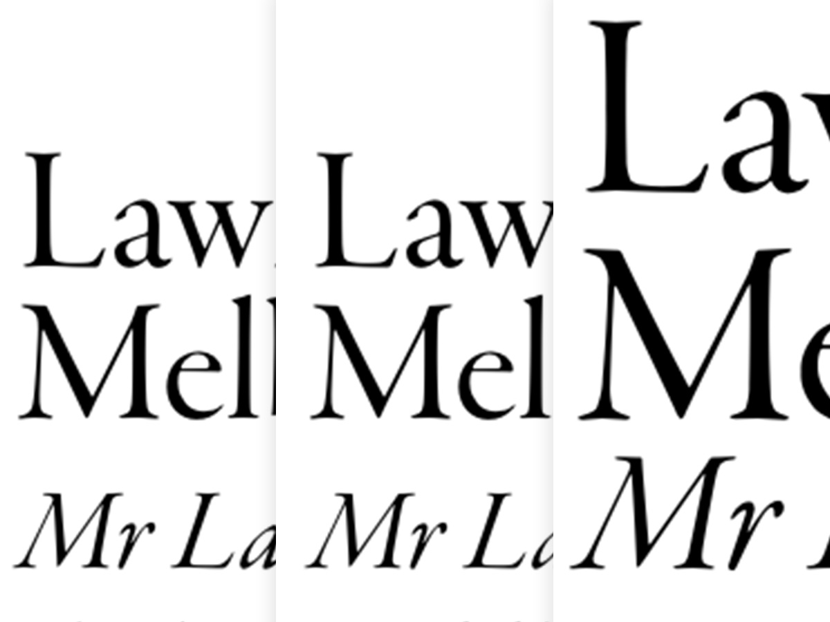
A proportionally scaled graphic showing the type rendering on each device.
The last graphic shows a ‘glyph vs glyph’ comparison, which allows us to compare the device-pixels going into each glyph, and the resulting clarity.
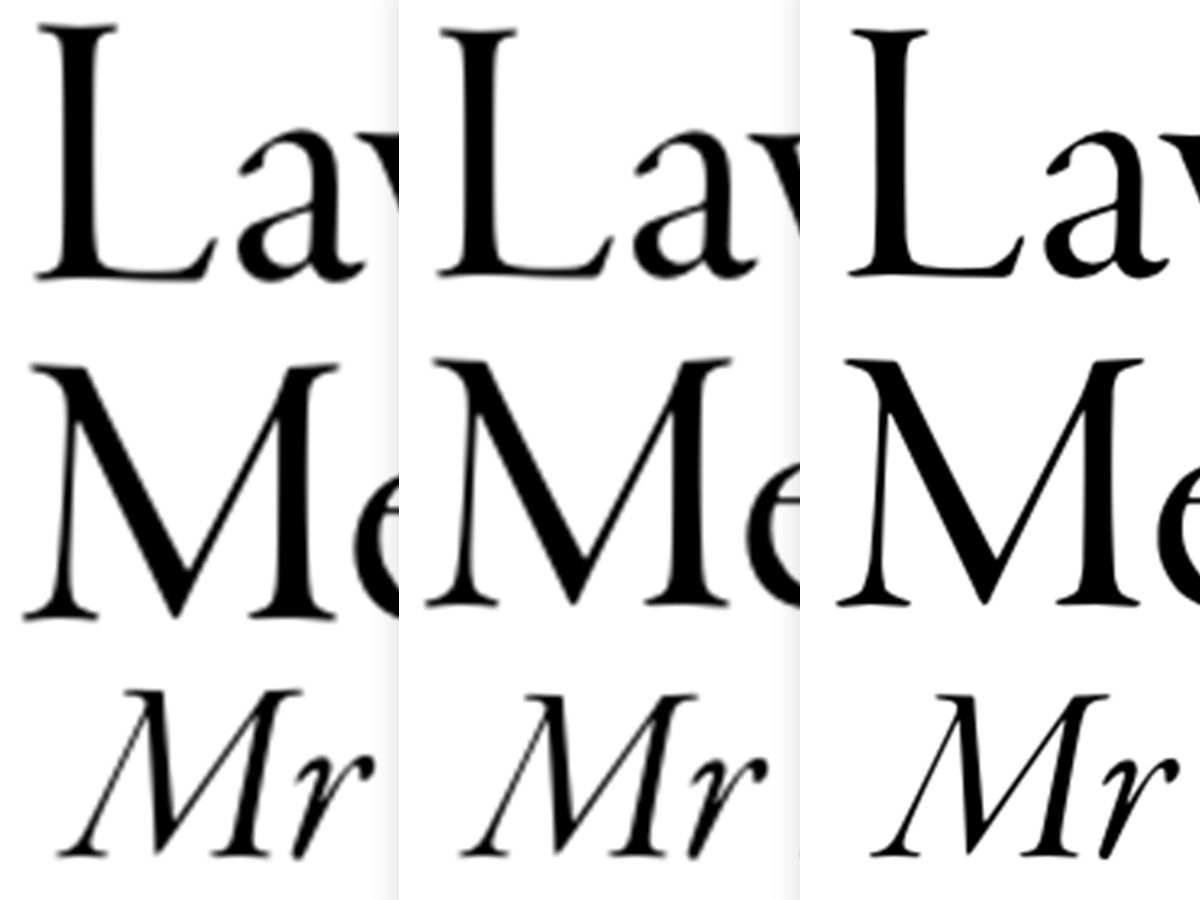
A ‘glyph by glyph’ comparison showing the device pixels that are going into each glyph.
The focus of my original post was not to be too technical, but to speak about the presumed experience that users will have with these new devices. Whats important in my view is the resulting ease of reading, the reduction in friction caused by the device (visible pixels etc) and the final quality of the rendered type, to the human eye.
