Apple’s new Macbook is a big signal for web designers
March 13, 2015

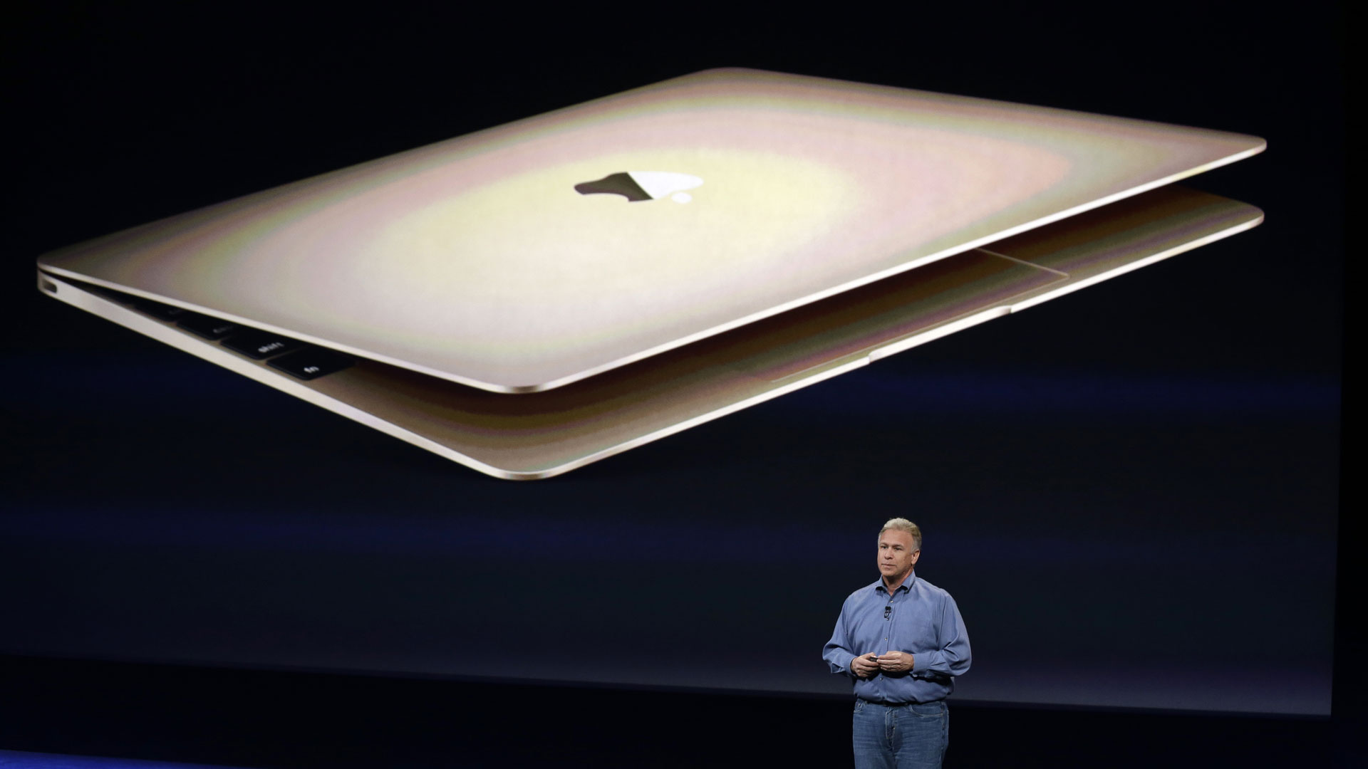
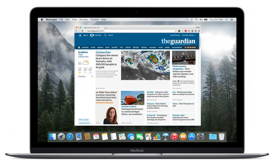
Congratulations to Apple today on the launch of their new Macbook range with Retina displays. This new range of entry level MacBooks ship with a display rendering 226 pixels per square inch.
Apple’s influence on the market is undeniable, one only has to look at the plethora of iPhone lookalikes to understand their market leading and trend setting position.
I have tried to source some stats for this post, but found it hard to understand:
- What percentage of all laptop sized web sessions are on MacBooks, and
- The total market share of laptop sized web sessions broken down by pixel density (DPI, MDPI, HDPI, XHDPI). (Retina is classed as XHDPI).

So what does this signal?
Designers need to take seriously this new Retina or XHDPI device hitting the market. We must think forward, and design for the web assuming HDPI devices are the norm. Many of us are doing this every day, but with the upward trend in display resolution density penetrating the laptop and desktop markets on masse, sites only supporting @1x graphics, fonts as graphics and non-responsive imagery will quickly feel dated.
As consumers buy these devices from Apple, and enjoy the gorgeous Yosemite UI and all its fine lines and sharp type, they’ll no doubt expect the web they browse to look just as good.
Its a shame that the HTML5 <picture> element hasn’t made it main-stream as I write, but there are some great resources out there today that can get the job done. The Filament group provide a great picture element polyfill that you can implement today.
This signal requires a mental shift, but it has to happen industry wide. Its like continuing to supply a printer with 150dpi artwork when 300dpi printing is the standard.
Its time, as an industry, we got our ducks in order and had these HDPI machines display all our designs as they should be. Its just not acceptable any more to publish or maintain a website which only supports graphical rendering on standard resolution devices.
