
Why Flat Design is just like Helvetica, and why we’ve got to do better.
April 1, 2014
I want to draw our attention to the similarities flat design as a movement shares with the popular typeface Helvetica.
Our trendy, flat, web-design style’s not dead. Don’t worry, it’ll be a popular look for many years to come. Quick background – Tobias Frere and Hoefler couldn’t have said it better in the documentary Helvetica1.
“There’s something about the typeface that invites this sort of open interpretation.”
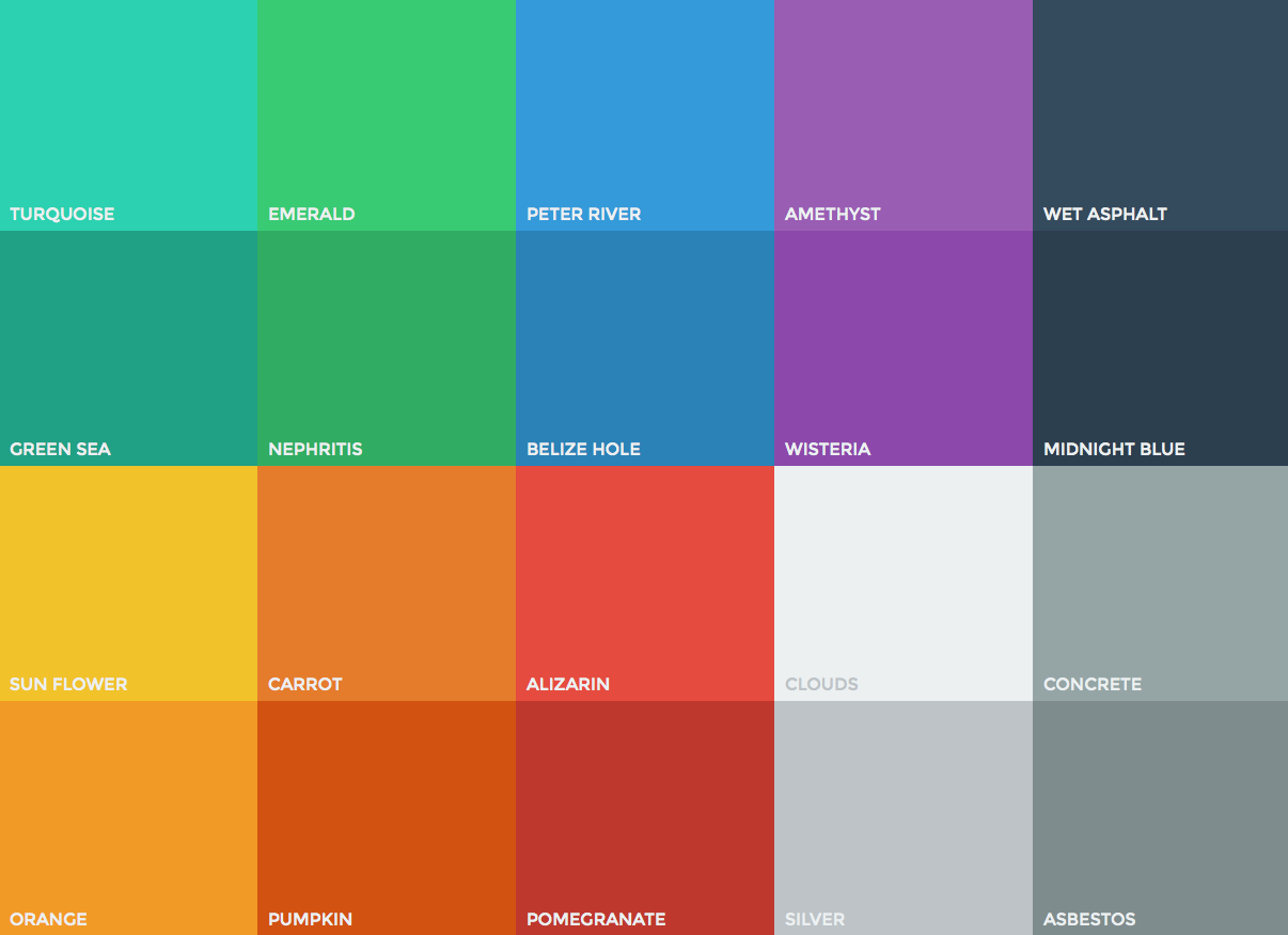
The rise and public acceptance of Helvetica did great things for the print and advertising in the 60’s – 80’s. It opened up new markets, spoke to new consumers, and fostered sweeping public acceptance of brand campaigns through its innovative and uniform look. So swap out “Helvetica” for “Flat design”, swap out “60’s – 80-’s” for “last 3 years”, and swap out “print and advertising” for “websites” and you’ll see what I mean. We’ve proved as an industry that clean flat, minimal design style on the web works. Its great, because we’ve dropped a lot of excess baggage (full of heavy kilobytes), and now we’re helping create a better web-future. Page load times are down, and having a first class experience on a smartphone is a reality today. There’s a growing trend of designs becoming ‘too flat’ – and those designs are just too easy to do. There is a danger of this popular and widely welcomed style being applied too liberally, without thought or consideration. There are tools that let you drag and drop big blocks of flat design around, and I don’t think that web design is this modular, this simple. Development might be, but great design thinking, no. Is this great use of technology, or irresponsible shortcutting?
Designer David Carson says in ‘Helvetica’:
Don’t confuse legibility with communication. Just because something is legible doesn’t mean it communicates and, more importantly, doesn’t mean it communicates the right thing.
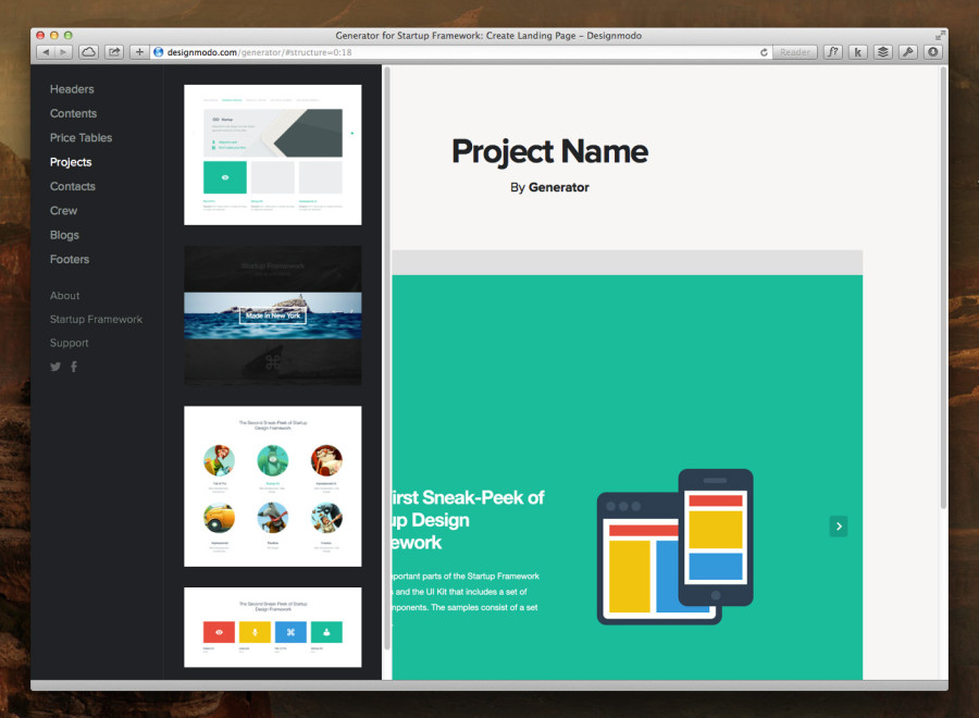
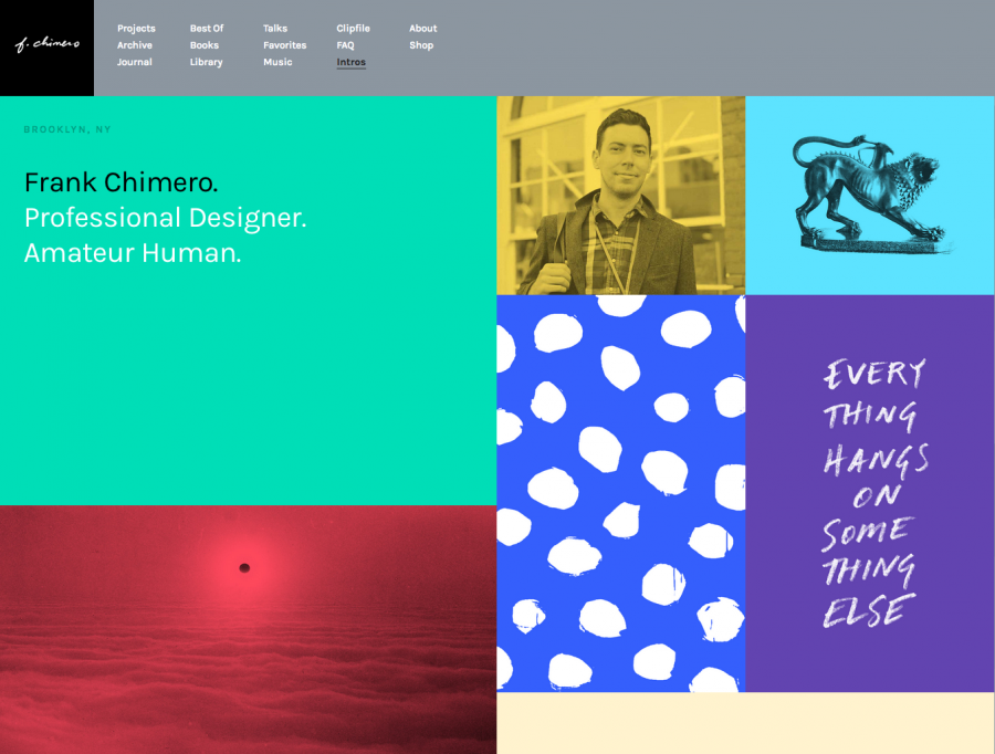
Flat design is like helvetica because its so very easy to use, and its being used everywhere. Everything’s starting to look the same, and when that happens, brands, personalities and organisations start to loose their individuality and character. And thats not a good thing. Don’t get me wrong… I do believe slimming things down is good – getting webpage weights down is a fantastic new industry standard we’re seeing. Things like massive background images, easily replaceable image sprites and extra HTTP requests are consciously keep out of my practice. I advocate the substitution of them every day. I think that when flat design is mindlessly applied by designers, branding, identity and the actual communications taking place suffer. So many out-of-the box tools and libraries are being used without customisation and personalisation. We’re ending up with a large body of monotonous, ‘flat’ styled designs who’s only want is to look like each other, to ‘be on trend’. This is a problem because design thinking for every project and brand needs to develop principles and ideas. These principles and ideas then underpin all branding, application and styling. This needs to happen in any design process, and exist irrespective of the style. Wether it’s a Skeuomorphic homage to early iOS, or a future-friendly lightweight design with speed in mind, out doesn’t matter. There are some great examples of modern flat design out there that were thought through well. Frank Chimero’s latest site design delivers a truly engaging and informing read. Laden with quality pictures and a tuned colour palette, its a joy to read and use, but its not a drag and drop affair.
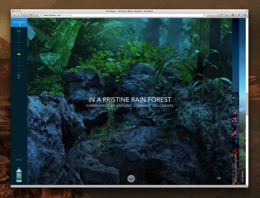
Fiji Water is great. Its a new site, its mobile optimised, you’re literally in the product its so immersive.
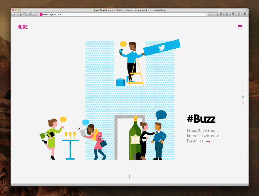
Huge Inc. is killing it, because while their site is big, wide, clean and open, they have beautifully clean and clear detail in their illustrations. They’re the agency in the situation, but the focus is clearly on their client, not them.
Simply placing a big block of brand colour on a page, with a video on top is not, at the end of the day, great web design. It’s contemporary, its modern and its nice to look at. Its entertaining, and it definitely helps brands appear to deliver a fresh new experience. But often its not the result of a genuinely methodical and considered design approach. What’s the best way to showcase the feeling, the soul of a brand on a webpage? If we consider backlit pixels as a medium, what textures, what methods and processes can we use to create and evolve engrossing & thrilling experiences? I imagine a world where good, considered design delivered over the web replaces a plethora of useless printed communication. It doesn’t just achieve time and production cost savings. Through design, It achieves more lively, more informative and more successful communications. You can’t just buy good design, but you can buy the time and expertise for good design thinking to take place. Flat design is not good design when it’s ‘off-the-shelf’. It only becomes good design when a great utilisation case is identified, and it enhances a brands online identity and communications. I believe designers can use Flat design in a clean, modern and engaging way, and that we can still impress users and wow surfers while holding the brand torch high. My point is that not everything has to look like a flat brand-coloured pancake. We all know as designers that while Helvetica is great, there are many ways to skin a cap.