iOS App theme for realestate.com.au
September 25, 2013
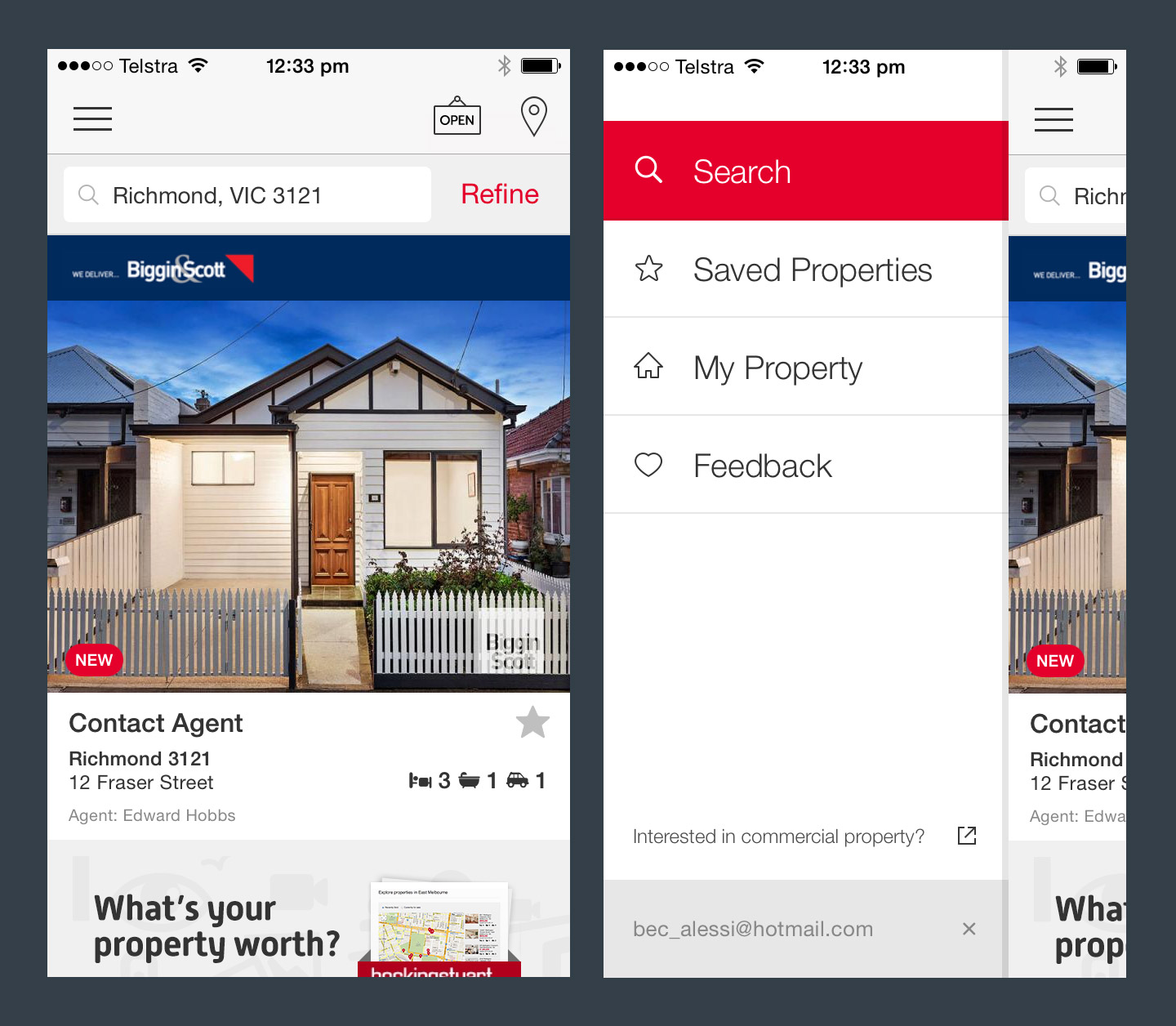
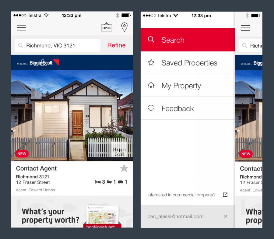
In this project we designed and delivered a new theme for the realestate.com.au iOS apps (iPhone and iPad). Using our previous dark theme as a starting point, the design team produced a clean and clear overhaul of the app, set on a solid white base.
We drew influence from market leading apps and patterns as iOS7 emerged, and wove these influences into our design. A delicate development process followed, with involved design-dev paring over several months.
Objectives
To update the theme of our iOS apps, and bring our product in line with market leaders around the release of the iOS7. To deliver a new, clean, white aesthetic to our app users, reflecting of our future design approach.
My role
As some of my early work at the company, my role was to pair with the head of design to study market leading apps, identify emerging trends, and to define and crystallise a clean new style for our iOS apps. I worked directly with the iOS development team during the implementation phase, which involved frequent decision making, collaboration and compromise to reach our final solution.
I mapped out and workshopped most screens inside the app, from the results set to the refinements, through to the menu and login process. In some places there were only light touches, in others more significant re-designs.
Outcomes & results
The refreshed style of the realestate.com.au iPhone app was a successful update, and was embraced by our wide audience immediately. The design’s clean, flat design style yielded a significant performance increase, through decreased asset library size.
The clear and open aesthetic demonstrated here paved the way for the look and feel of future products across the company.
Our iOS app is available for download in the App Store.