
A new flat style for Twitter.com
January 14, 2014
I noticed today that Twitter has released a new ‘flat’ styled theme for their desktop site. As techrunch.com points out, the theme is much more in keeping with their new mobile apps and mobile site.
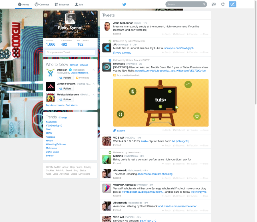
In my view, its a great design update. The site maintains the same structure, but is immediately more usable.
Flat colours and more obvious navigation highlighting combine to make the site feel fresh and clean. By removing outdated ‘chrome’, guff, gradients and lines, Twitter’s cleaned up the interface significantly, allowing easier access to, and reading of the content.
Font sizes in the main tweet area appear the same, but the inferred break between tweets is much more succinct. This has probably been designed to facilitate a more enjoyable and streamlined reading experience of the threaded conversations, which twitter announced and released last year.
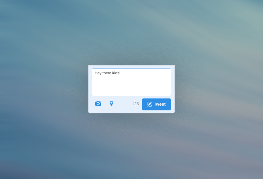
My fave part? The new compose box, with on-trend flat colour ‘tweet’ button complete with icon-font really takes the cake. Its a great example of a company delivery the most important feature of their site in basic HTML + CSS – and not overthinking it.
Hats off to the design team at Twitter.com!