Sunrise vs Apple Calendar – a Design Comparison
March 17, 2014

Last week a great iOS app launched a big update – Sunrise now supports Exchange calendar syncing. Long the bain of many corporate employees locked into Microsoft’s proprietary software. For many – the only way to view your Exchange calendar on iOS was through Apple’s Calendar app.
Until today. Im using the latest update of the Sunrise app, and I’m impressed. So impressed, I thought I’d put together a side by side comparison of a few features, to see them side by side with the Calendar app.
Its a hard task, I imagine, creating a calendar app, with Exchange support. Take mail apps for instance. There’s a plethora of mail apps that have Gmail and IMAP connectivity, and cater well to various niches. There are few iOS apps that do Exchange mail well. I’ve learnt from research that licensing the proprietary Microsoft software has been prohibitively expensive in the past.
As a designer, I just get the urge to expect more from Apple Calendar.
Apple’s Calendar app isn’t that bad, hey – at least there’s no more ‘fleather’ (faux-leather). As a designer, I just get the urge to expect more from Apple Calendar. Its plain, and very clean, because it has a responsibility to cater to everyone. Every iPhone user. But by my book, that’s no reason for it to be bland and cold.
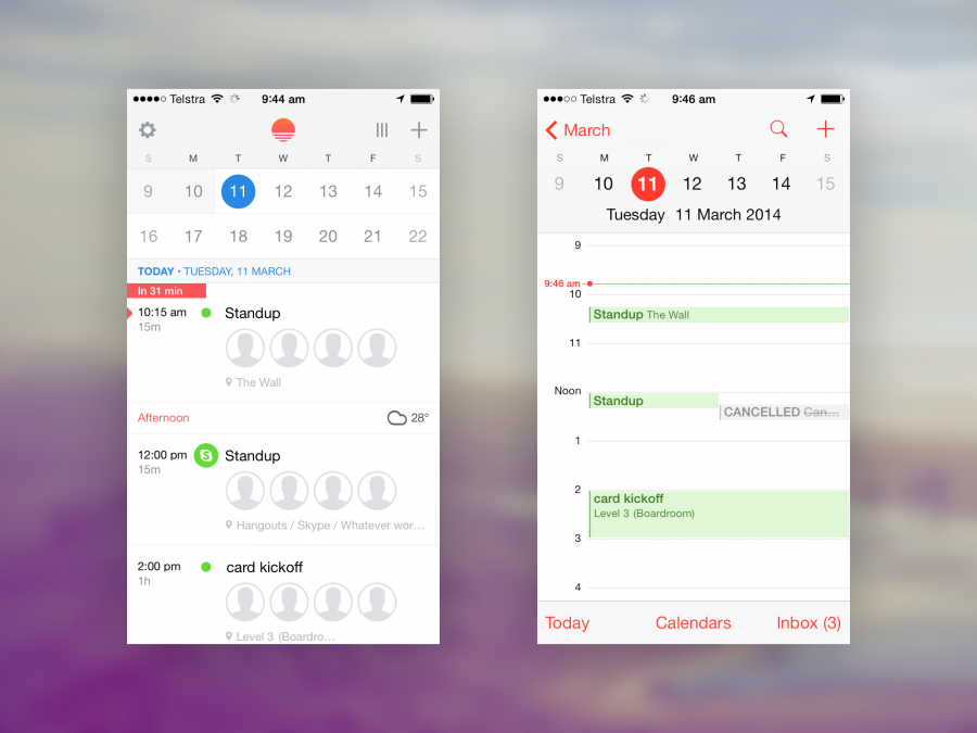
(In the below screenshot comparisons, Sunrise is pictured on the left, Apple Calendar is pictured on the right).
Straight away my eyes were drawn to the little weather icons. Fantastic stuff. I don’t often leave the office for walks or off-site meetings, but when I do, its super to see how the weather will trend over the next few hours. Its not rocket surgery, dropping simple weather icons into a Calendar app. Its the effortless placement of these icons into the event feed adds big value to this app. Its just reassuring, it adds comfort and trust to the experience. This is simply not available through Calendar.
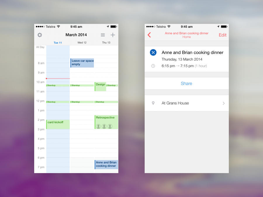
A little noticed, but informative tweak is the contextual icons overlaid on the calendar colour circles. In quickly adding a family event, Sunrise picks up on these keywords, and marks up my event with a knife and fork icon. Love it.

The three day view that Calendar provide isn’t exactly innovation, but the delivery is right on point. Seeing the next three days up on the screen at once is great – you can feel the density of your upcoming schedule. Yes, to be fait you can get this from the single day view on both apps, but the execution in Sunrise is great. The simple animated navbar icon tells a great story with its eased rotation. Very slick.
“Mobile users deserve no less of an experience than a desktop view”
From a UX perspective, it heralds the modern mobile-first web design mantra: “mobile users deserve no less of an experience than a desktop view”. It feels like a power user feature, and will probably only get limited use. In a new world of uber-clean and minimal design, its great to see Sunrise delivering this option.
In the bottom left corner of Sunrises screen is the red ‘today pointer’. A nice and simple UI element that just points to ‘today’. Travelling back I’m time rotates the pointer down, and flicking forward in time spins the pointer upward. Just seeing that animation take place is enough to explain its real purpose – a clean and efficient anchor back to the today view. While Calendar’s new, and highly useful ‘Today’ text-button performs the same function, Sunrise’s does it with style.

So by this stage, the app is feeling really nice. We’ve seen a great fresh take on a standard issue calendar app. There’s no crazy design changes, there’s no groundbreaking new interfaces to learn, just a good solid app that works well, first time.
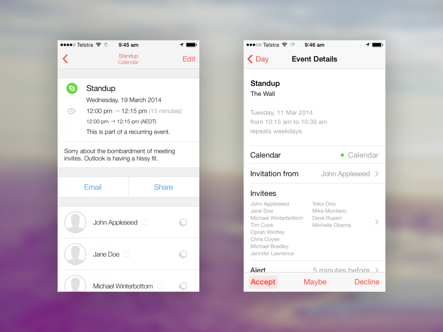
Adding events is a breeze too – the standard iOS controls have been iterated on and improved to make the event creation experience easy. There’s great high quality contextual icons in here all over the place, and it significantly improves on Apple’s now quite mundane and dull text based experience.
Calendar shows me where I am, and through ingenious implementation of the ‘compass style’ ‘today’ pointer, i can instantly feel at a glance how far I’ve travelled from today, the meetings and event Im closest to. With multiple calendars, from home and work, plus birthdays, the time travel and list length can be significant, i can, without much effort, be 10 – 20 thumb-flicks away from today. There just isn’t an equivalent in Calendar.
Im really enjoying using this app. From past experiences with apps not living up to their app store promises – failed synching, duplicate events and so on – this Sunrise update really nails it. I’d strongly recommend giving it a try, it’ll improve your business workflow and planning, and finally, you’ll enjoy the interface and experience.
